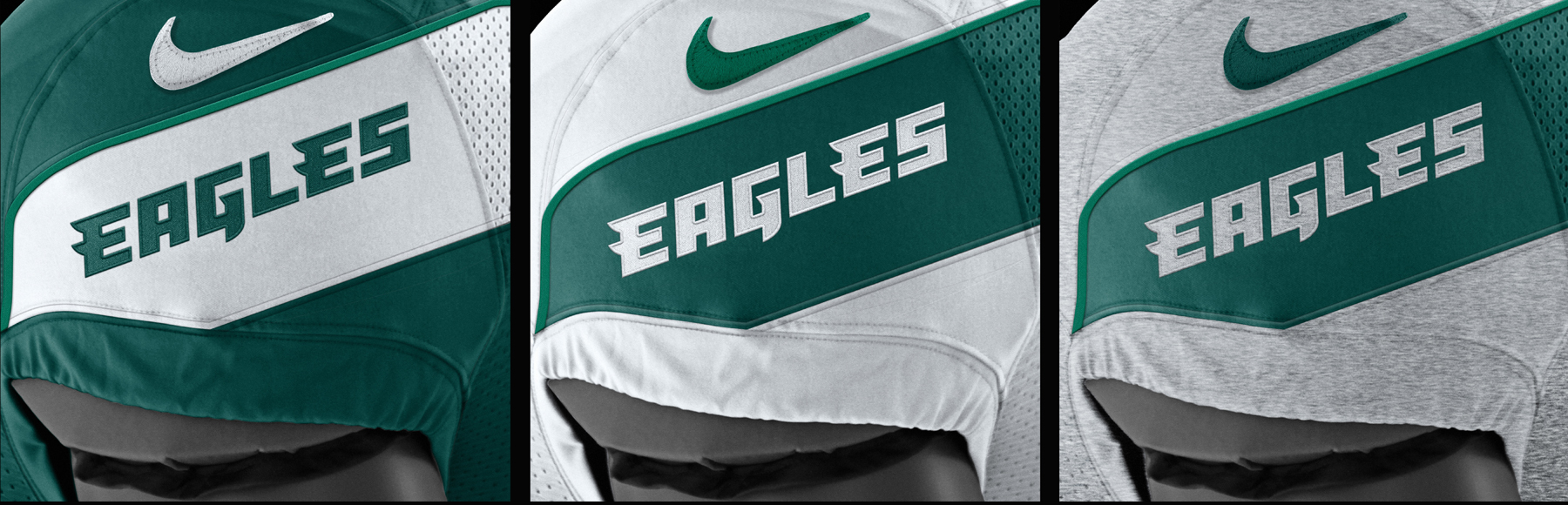
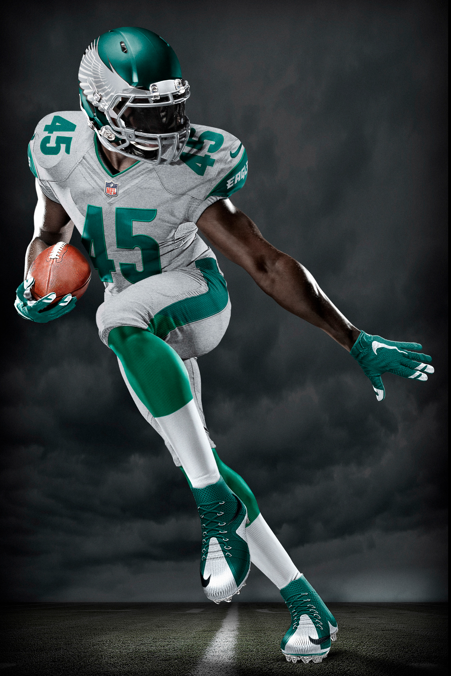
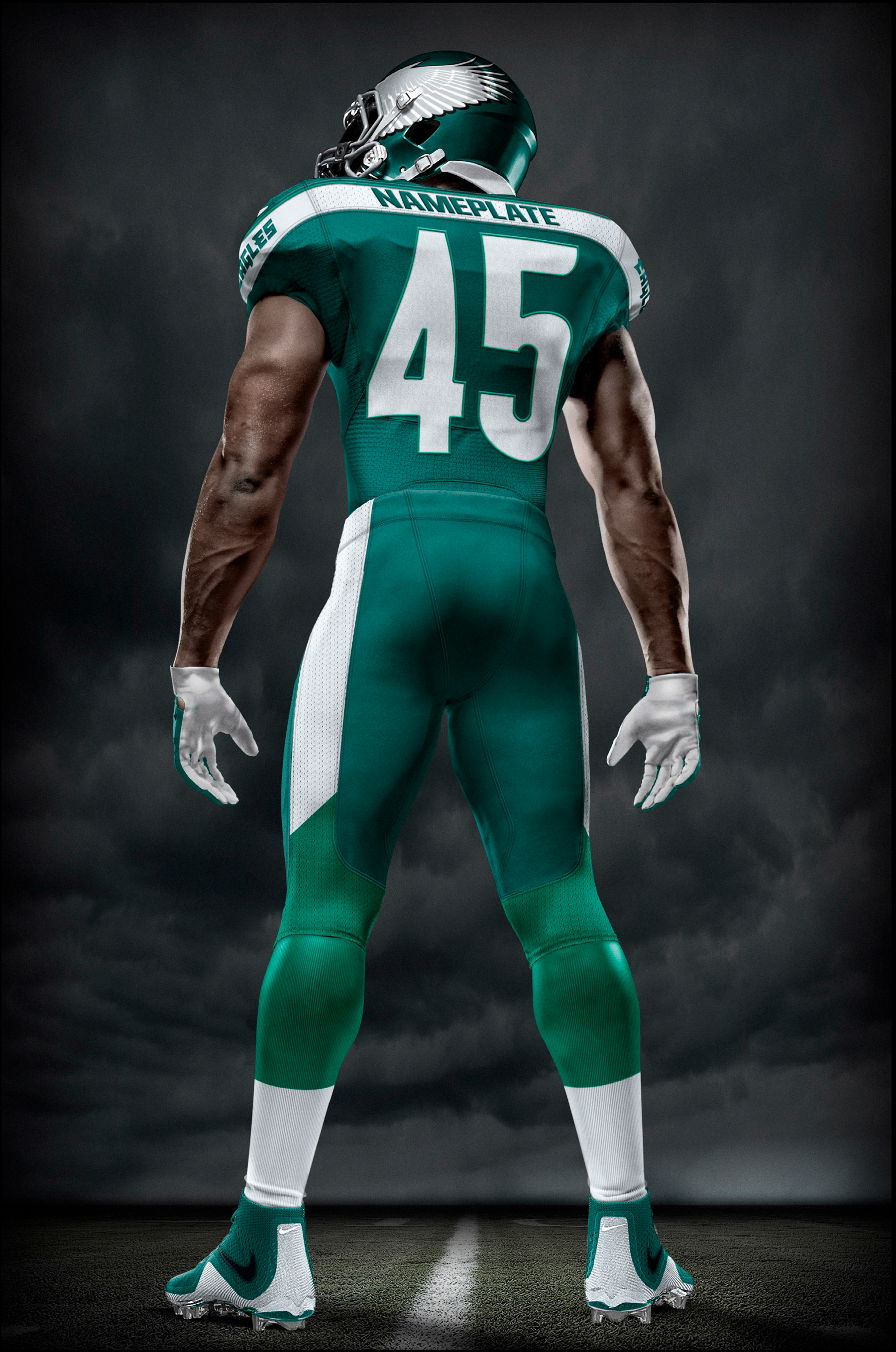
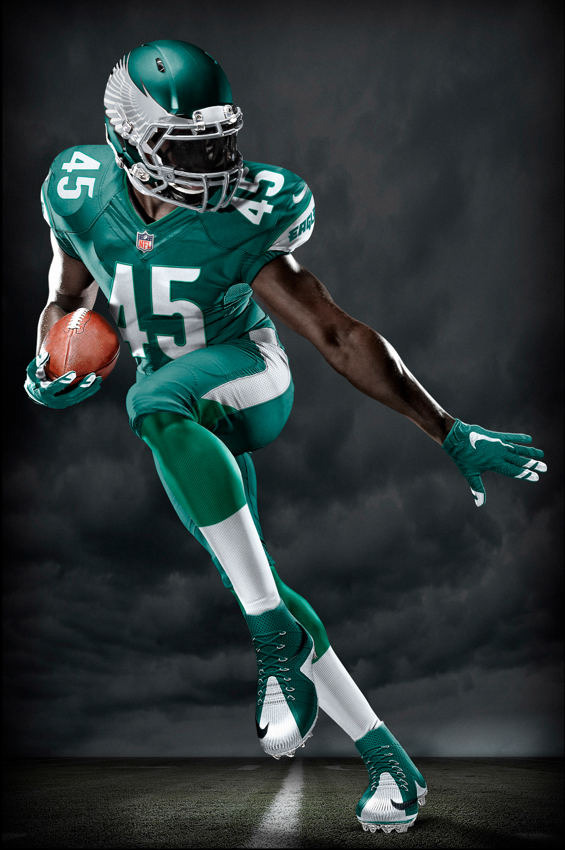

Philadelphia Eagles
The Philadelphia Eagles
requested our help to update their brand by developing a new primary mark,
logotype, and uniform design. It was an incredible opportunity to work on a
team steeped in so much history and that has such an avid fan base. We first
adjusted the primary mark by shifting the head of the Eagle in an attempt to
create more of a connection between the viewer and the subject. We used its eyes,
said to be a window to the soul, to highlight the club’s intensity and drive.
We then simplified the logotype and picked up some of the personality of the
primary mark in order to bring the two together more closely. The wing on the
helmet stayed true to what an Eagles wing has looked like, so that there is no
mistaking it for any other bird. The uniform design was simplified while
bringing in the toughness of the heather pattern, inspired by the team’s hardworking,
blue-collar fans. Befitting the spirit of the City of Brother Love, it was an All
Business and No BS approach.


Scott Faries //